NME Lily Allen
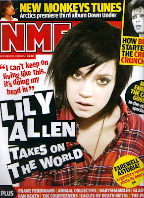
This NME edition features Lily Allen on the front cover. The colour scheme of the font is similar to all the other NME magazines I have looked at. They use contrasting colours; black, yellow, red and black. The colours are eye catching and give the magazine a branded appearance. 'Lily Allen' is wrote in a font larger than the NME title, like all the other NME magazines the magazine is so well branded it doesn't need to make the title stand out the most, rather attract the audience through mentioning who features in the magazine.
Lily's photo is in a indie and rock theme, this reflects the magazines genre but less so Lily's own appearance. The quote of Lily is a small section of speech, it interests the audience into what its about and intrigues them into reading more. Lily's image appears to come out from the background, through Photoshop.This makes Lily draw in the audience and interact with them when they pick up the cover of the magazine. Lily's make up is fairly stated, this gives her a rock chick appearance, to reflect the genre of the magazine.
The cover also includes several well known music artists in bold fonts; this is too appeal to the audience and conforms to the conventions of music magazines as they work to attract readers and a certain genre of music tastes.
The cover includes various adverts in different shapes and colours about details inside the magazine. The shapes cover various parts of the main image in different directions; many music magazines include adverts about the contents of the magazine to appeal to the audience.
No comments:
Post a Comment