NME The killers
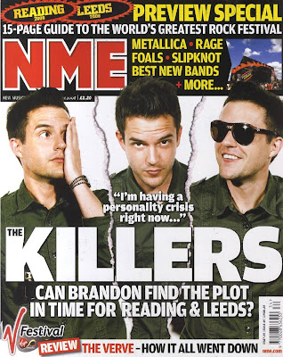
 NME is a indie music magazine. This edition features the Killers and advertises a Rock festival, Leeds and Reading. The magazine cover has a three way colour scheme of yellow, red and white. This is eye catching and gives the magazine a recognizable appearance. The title 'The Killers' is larger than the magazine title its self. Te significance of this is that the magazine doesn't feel like it needs to tell the audience who they are, more that they want to interest the reader into the features of the magazine. This suggests NME is well known and branded well. Most music magazines tend to have one large image of a music artist on the front of the magazine, NME in this edition has used a different approtch. Although they have only used one person for the images (the lead singer of The Killers), they have used three different images of him to make it appear that there are 3 different people on the front cover. The magazine highlights the festival feature large by the title this is to draw in the attention of the reader. The cover is very busy, and initially all the detail isn't clear, this potentially interests the reader more to have a closer look.
 Analyzing this magazine cover was especially useful as I have been planning on having my own cover, or the double page spread with several images of one person in slightly different angles from the same photo shoot. The way in which NME creates this cover is partially good as initially you cant even tell the three images aren't different photos and are of the same man. Also the magazine focus' on festivals in the adverts for inside the magazine, and I'd like to do similar on the front of my magazine. Festivals seem to be appealing for audiences as they create mass interest and involve a lot of music tastes.
No comments:
Post a Comment