The first letter of the article is nearly the length of the page, and half the width. Often the first letter of a magazine article is larger than the majority of the text but this article has the first letter majorly over exaggerated. The letter fills in white space of the page without having any other photos than the main photo of Lana Del Rey; the one photo draws all the audiences attention to Lana. The title of 'Lana Del Rey' is small part of the page, the words seem irrelevant to the large image of Lana which is more useful in defining who the article is about. The image of Lana is very colourful and contrasts with the opposite side which is bland with just black and white colours.
Lana Del Rey Article Analysis
Q Lana Del Rey
 Last year in a Q magazine there is several double page spreads about Lana Del Rey as she found herself in the music industry. The article appears to aim at a female target audience, probably older teens- young adults age range. The article appeals to women more as it discusses Lana's outfits and make up in the Q photo shoot. She wears a 'white crop top and jeans' seems to be an element a female audience would be interested in. There is lots of intense description used when explaining her facial features, 'the epic pout' and 'big deep pools of her eyes'.
The first letter of the article is nearly the length of the page, and half the width. Often the first letter of a magazine article is larger than the majority of the text but this article has the first letter majorly over exaggerated. The letter fills in white space of the page without having any other photos than the main photo of Lana Del Rey; the one photo draws all the audiences attention to Lana. The title of 'Lana Del Rey' is small part of the page, the words seem irrelevant to the large image of Lana which is more useful in defining who the article is about. The image of Lana is very colourful and contrasts with the opposite side which is bland with just black and white colours.
The first letter of the article is nearly the length of the page, and half the width. Often the first letter of a magazine article is larger than the majority of the text but this article has the first letter majorly over exaggerated. The letter fills in white space of the page without having any other photos than the main photo of Lana Del Rey; the one photo draws all the audiences attention to Lana. The title of 'Lana Del Rey' is small part of the page, the words seem irrelevant to the large image of Lana which is more useful in defining who the article is about. The image of Lana is very colourful and contrasts with the opposite side which is bland with just black and white colours.
NME Lily Allen Article
The double page spread features Lily Allen, giving an in depth, truthful article about the artist. The page is loud and stands out to anyone reading through the magazine. The title is a quote from Lily in a extremely loud font, the font is rebellious and unusual reflecting what Lily is saying in the speech quote. The way in which some of the letters are larger than others seems to really shout out to the audience. The A4 image of Lily to the right of the title has a similar rebellious feel with her dark make up, tattoos on show and choice of outfit. The image and title not only reflect the text in the article but also Lily's own personality and the way in which she wants to come across through her music.
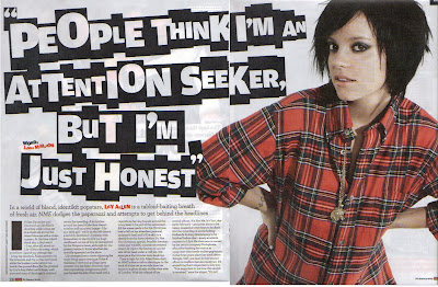 The colours on the page including the text, title, image and background all stick to a specific theme. The colours being white, black, red and orange. The white background allows the image and text to stand out. The black text is a contrast to the white background and the colourful image is an obvious opposite to the background. The article itself talks about Lily's music career, unlike a women's magazine it doesnt focus on the gossip of celebs, much more about what they are doing musically and what they hope to do in the future. This article is also a cry out to the audience from Lily about what she believes she is really like.
The double page spread features Lily Allen, giving an in depth, truthful article about the artist. The page is loud and stands out to anyone reading through the magazine. The title is a quote from Lily in a extremely loud font, the font is rebellious and unusual reflecting what Lily is saying in the speech quote. The way in which some of the letters are larger than others seems to really shout out to the audience. The A4 image of Lily to the right of the title has a similar rebellious feel with her dark make up, tattoos on show and choice of outfit. The image and title not only reflect the text in the article but also Lily's own personality and the way in which she wants to come across through her music.
 The colours on the page including the text, title, image and background all stick to a specific theme. The colours being white, black, red and orange. The white background allows the image and text to stand out. The black text is a contrast to the white background and the colourful image is an obvious opposite to the background. The article itself talks about Lily's music career, unlike a women's magazine it doesnt focus on the gossip of celebs, much more about what they are doing musically and what they hope to do in the future. This article is also a cry out to the audience from Lily about what she believes she is really like.
Q Contents Page Evaluation
 There is a large image of a man in the music industry used, which covers half the page. The image itself fits with the colour scheme of the page. The photo is taken in a studio, but is emphasized through the camera equipment in the background. The photo is used to show the sort of behind the scenes of a photo shoot. The photo is very natural, therefore the audience feel they can connect with the man, this is often the case in the articles in the magazine. Unlike celeb style magazines, music magazines tend to focus on looking at the artist themselves and their music rather than the newest gossip. So images which seem natural and real on the contents reflect the magazine inside. The positioning of the photo is in the centre to the right. The smaller adverts for different pages border two sides of the image, this draws the attention in to the main image then round to the outside to the smaller sections.
The Q contents page consists of a British theme. There is an article in the magazine about the 50 Ultimate British songs; the article advert becomes a main focus of the contents page as it has the largest and top section of the 'Features' column. The British flag is signification on the page as it fits with the colour scheme of the magazine. Q is an iconic British magazine, this is reflected in the magazines colour scheme, the white, red, blue and black which are the colours of the British flag. Q magazine has a recognized branded appearance throughout all of their magazines.
The titles of the feature section tend to be names of artists or bands such as James Blake, Edward Collins and Elbow. The names are clear and in bold, the audience is drawn to this section and the use of names would attract the audience to want to read more about the artists. Another way in which Q advertises pages later in the magazine is through smaller versions of the pages and then their page numbers fairly large and bold over the top.
The image isn't just used to fill up space, it is an advert for a page in the magazine. Without any words the audience is intrigued and can find out more about the photo on page
'42' which is wrote in a very large font on top of the corner of the image.
The title of 'Contents' is placed on an extended 'Q' logo red box. The title isn't a substantial part of the page, the font is similar to all the text on the page and the size is not significant. This is because the objective of this page is clear through the images, page numbers and subtitles. The 'Q' logo also isn't partially significant as Q is so well known it doesn't need to emphasize what magazine it is.
Q Contents page
The Q contents page first draws the attention the fairly large, standing out 'Q' logo. The page also consists of a large image. The image being of Elton John, a well recognized iconic British music artist. The image of Elton John is an advert for an article about him later in the magazine, the advert has no text which would intrigue the reader into wanting to know more. The magazine can do this because Elton John is so well known that they know people would be interested in an article about him.
 The colour scheme is simple, red, white and black. The colour scheme runs through out Q magazines and gives the magazine a well branded appearance. The page is set out in a series of boxes ans subheadings. The boxes allow the magazine to fill the page with information without appearing too busy so the reader is put off reading into the different articles. The contents page only advertises a few pages in the magazine, but there are many more in between The articles used on the contents page are a range of different interests in the music industry so appeals to wide range in their target audience.
Q magazines are pretty mainstream. The artists included tend to be very well known and liked by many. Often as well they are involved in the pop genre, but there are some articles which vary, such as the article about whether Indie is hooked on crack.
The page uses all the space, it even sneaks in a small part about a Chris Moyles article along the bottom, filling the page gives the magazine the appearance that is full of interesting articles and it has a lot of content.
The fonts are bold for titles and subtitles, and all the fonts are a clear plain type which is easy to read. The fonts all seem to match and keep the busy page looking neat. The page numbers stand out because they are in red; this is important as the audience want to know exactly where the articles are and to use the contents page to navigate around the magazine.
The target audience attracted to this page could be argued is very varied. Some may say the Elton John feature appeals to an older audience, along with articles about U2. However it is hard to define what artists and bands appeal to one age range because musical tastes are often passed down through families and generations.
The Q contents page first draws the attention the fairly large, standing out 'Q' logo. The page also consists of a large image. The image being of Elton John, a well recognized iconic British music artist. The image of Elton John is an advert for an article about him later in the magazine, the advert has no text which would intrigue the reader into wanting to know more. The magazine can do this because Elton John is so well known that they know people would be interested in an article about him.
 The colour scheme is simple, red, white and black. The colour scheme runs through out Q magazines and gives the magazine a well branded appearance. The page is set out in a series of boxes ans subheadings. The boxes allow the magazine to fill the page with information without appearing too busy so the reader is put off reading into the different articles. The contents page only advertises a few pages in the magazine, but there are many more in between The articles used on the contents page are a range of different interests in the music industry so appeals to wide range in their target audience.
 Q magazines are pretty mainstream. The artists included tend to be very well known and liked by many. Often as well they are involved in the pop genre, but there are some articles which vary, such as the article about whether Indie is hooked on crack.
The page uses all the space, it even sneaks in a small part about a Chris Moyles article along the bottom, filling the page gives the magazine the appearance that is full of interesting articles and it has a lot of content.
The fonts are bold for titles and subtitles, and all the fonts are a clear plain type which is easy to read. The fonts all seem to match and keep the busy page looking neat. The page numbers stand out because they are in red; this is important as the audience want to know exactly where the articles are and to use the contents page to navigate around the magazine.
The target audience attracted to this page could be argued is very varied. Some may say the Elton John feature appeals to an older audience, along with articles about U2. However it is hard to define what artists and bands appeal to one age range because musical tastes are often passed down through families and generations.
NME Contents Page
This edition of NME features Oasis with the Crouch End Choir on the contents page. The contents page of a magazine is a sort of map for the audience to navigate where to find different articles and specific bands and artists. The page is made up of a medium sized image, fairly large title at the top, an advert for subscription, a brief indicator of some articles in the magazine and a index list of the bands included in the magazine.
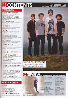 The title of the page is 'NME This week' all in the same font, the font being the font used for all the NME logos. This gives the brand a specific recognized look and stands out. 'This week' suggests its like the weeks gossip of the music world, its fairly informal and it draws the audience into wondering what is the news of the week. The page is set out in square boxes of different sizes, the page is busy with various different colours and things going on but is organised and aesthetically pleasing.
The colour scheme is the classic red, black, white and yellow contrasting mix. These colours are iconic to NME.
The page includes a lot of information and is used to draw the reader into what the magazine has to offer. The page is generally made up of subheadings; this attention grabbing and allows the audience to understand what the magazine includes without giving all the articles away before they've read the magazine.
The advert for the subscription stands out with the yellow font. The magazine would feel this advert is important as they are obviously wanting to make as much custom and profit as possible. Using the yellow font different to all the other coloured font gives the advert its own special edge and it is clear initially it is different to all the other sections on the page.
The band index isn't common on a lot of music magazine contents pages, but because NME mainly focuses on bands so therefore it would be an interest to the reader that they want to know about bands. The band index gives the audience the opportunity to navigate where to find pages of the bands they are interested in
This edition of NME features Oasis with the Crouch End Choir on the contents page. The contents page of a magazine is a sort of map for the audience to navigate where to find different articles and specific bands and artists. The page is made up of a medium sized image, fairly large title at the top, an advert for subscription, a brief indicator of some articles in the magazine and a index list of the bands included in the magazine.
 The title of the page is 'NME This week' all in the same font, the font being the font used for all the NME logos. This gives the brand a specific recognized look and stands out. 'This week' suggests its like the weeks gossip of the music world, its fairly informal and it draws the audience into wondering what is the news of the week. The page is set out in square boxes of different sizes, the page is busy with various different colours and things going on but is organised and aesthetically pleasing.
 The colour scheme is the classic red, black, white and yellow contrasting mix. These colours are iconic to NME.
The page includes a lot of information and is used to draw the reader into what the magazine has to offer. The page is generally made up of subheadings; this attention grabbing and allows the audience to understand what the magazine includes without giving all the articles away before they've read the magazine.
The advert for the subscription stands out with the yellow font. The magazine would feel this advert is important as they are obviously wanting to make as much custom and profit as possible. Using the yellow font different to all the other coloured font gives the advert its own special edge and it is clear initially it is different to all the other sections on the page.
The band index isn't common on a lot of music magazine contents pages, but because NME mainly focuses on bands so therefore it would be an interest to the reader that they want to know about bands. The band index gives the audience the opportunity to navigate where to find pages of the bands they are interested in
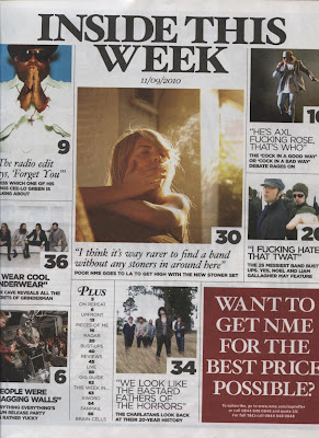 NME Contents page This edition of NME includes an contents page different to their normal lay out. The page is set up using a series of boxes in which different pages and articles are briefly mentioned with a small picture. The images are all of different music artists all showing a snapshot of very different stories inside the magazine.
The title is similar to a newspaper heading, it is attention grabbing and clear to the audience. It doesnt use the words 'contents page' but includes all the features of a contents page which is to inform the audience of articles inside the magazine and their page numbers. The contents page is like a small insight into the magazine aswell as being like a map of the magazine, allowing the audience to get bearings of what is going on in the magazine.
The page also includes an advert to buy more of the NME magazines, the advert is the corner but due to the bold background it stands out strongly on the page. The page has a fairly newspaper look, this contrasts with the front cover and gives a retro style to the page. The text and background is black and white therefore the images stand out through the vibrant colour, which attracts the audience to the stories invloved on the page.
NME contents page
 This contents page is from NME magazine. The magazine has used two colour images. The first one is a low angle mid-shot of the lead singer from Friendly Fires during a performance in a concert. The image draws the audiences attention to the bizarre twist of the singer dancing with an interesting looking show girl. The bold text below the image encourages the audience to the read more into the magazine.
Although the magazine aims to promote artists and bands, it also has to keep its own customer base and popularity up therefore a colour image used is copy of NME’s cover which is an offer promoting the audience to buy more copies of NME in the future. The offer is large and with a bold font so that the audiences vision is drawn to the advert imediently. The contents features 5 categories to the right side discussing the features of the magazine, this is an easy way of breaking down the magazine. It is very organised which is aesthetically pleasing to an audience. Unorganized pages may put audiences off carrying on reading anymore of the magazine if they cant simply find what they want to read about or what the magazine has to offer. NME use block colours and bold fonts to stand out and also keep the page looking neat and organised.
The colours used for the font and background boxes are the same as the colours NME use on the front cover (black, white, red and yellow.) The colours contrast and give the appearance of a wild, interesting and unusual magazine.
NME Lily Allen
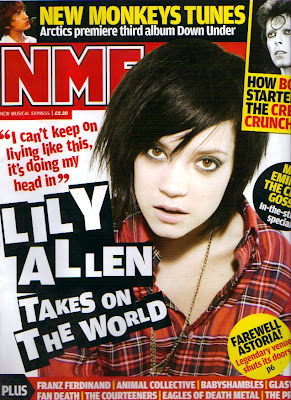
This NME edition features Lily Allen on the front cover. The colour scheme of the font is similar to all the other NME magazines I have looked at. They use contrasting colours; black, yellow, red and black. The colours are eye catching and give the magazine a branded appearance. 'Lily Allen' is wrote in a font larger than the NME title, like all the other NME magazines the magazine is so well branded it doesn't need to make the title stand out the most, rather attract the audience through mentioning who features in the magazine.
Lily's photo is in a indie and rock theme, this reflects the magazines genre but less so Lily's own appearance. The quote of Lily is a small section of speech, it interests the audience into what its about and intrigues them into reading more. Lily's image appears to come out from the background, through Photoshop.This makes Lily draw in the audience and interact with them when they pick up the cover of the magazine. Lily's make up is fairly stated, this gives her a rock chick appearance, to reflect the genre of the magazine.
The cover also includes several well known music artists in bold fonts; this is too appeal to the audience and conforms to the conventions of music magazines as they work to attract readers and a certain genre of music tastes.
The cover includes various adverts in different shapes and colours about details inside the magazine. The shapes cover various parts of the main image in different directions; many music magazines include adverts about the contents of the magazine to appeal to the audience.
NME Jake Bugg
This edition uses a new and upcoming artist Jake Bugg for the front cover. The cover is attention grabbing through the contrasting colours, banners and badges which include information of articles in the magazine.
'Jake Bugg' is wrote in a larger font than the title, this draws attention to Jake and then to the caption below which develops the audiences initial impression of him saying he is 'The enemy of X Factor'. The image of Jake works well with the different colourful fonts as it is black and white, therefore allows the front to stand out and differentiate clearly between the text and image. Various names of well known people in the music industry are mentioned on the front of the magazine, this attracts the audience and conforms to lots of music magazines as they all want to appeal to a large audience. Such as 'Noel Gallagher' mentioned with Jake Bugg, Noel Gallagher is wrote in yellow to stand out as he is such a well known, musical inspiration to many. Unlike many other music magazines there are smaller images on the front cover along with the main image. The smaller images are fairly low key and don't initially grab the audiences attention, but on a closer inspection they open up more about what is included in the magazine.
NME The killers
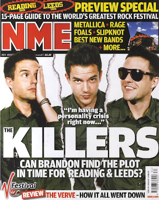 NME is a indie music magazine. This edition features the Killers and advertises a Rock festival, Leeds and Reading. The magazine cover has a three way colour scheme of yellow, red and white. This is eye catching and gives the magazine a recognizable appearance. The title 'The Killers' is larger than the magazine title its self. Te significance of this is that the magazine doesn't feel like it needs to tell the audience who they are, more that they want to interest the reader into the features of the magazine. This suggests NME is well known and branded well. Most music magazines tend to have one large image of a music artist on the front of the magazine, NME in this edition has used a different approtch. Although they have only used one person for the images (the lead singer of The Killers), they have used three different images of him to make it appear that there are 3 different people on the front cover. The magazine highlights the festival feature large by the title this is to draw in the attention of the reader. The cover is very busy, and initially all the detail isn't clear, this potentially interests the reader more to have a closer look.
 Analyzing this magazine cover was especially useful as I have been planning on having my own cover, or the double page spread with several images of one person in slightly different angles from the same photo shoot. The way in which NME creates this cover is partially good as initially you cant even tell the three images aren't different photos and are of the same man. Also the magazine focus' on festivals in the adverts for inside the magazine, and I'd like to do similar on the front of my magazine. Festivals seem to be appealing for audiences as they create mass interest and involve a lot of music tastes.
Mag Eval
Q Tinie Tempah
The Tinie Tempah Q edition is a special 25th Anniversary edition. The cover appears different to the traditional Q Magazine covers. The cover does conform to several normal Q features. Such as one main large photo of a musical icon, the slogan is slightly covered and the artists name across the front of the photo. All three features make the magazine still feel like a Q cover but the variations make the magazine noticeably different and a collectors item.
Normally the Q magazines used a selected colour scheme based around red, white and black.In this edition there is more variety with pink and blue, used to link with Tinie's shirt in the picture. The front cover includes less information about what is in side the magazine than most Q's. The font used is made to look hand written and 'Tinie Tempah' is wrote like a signature, this edition appears more personal.
 The magazine cover also has a border, unlike most Q covers; This makes the cover look like a picture. The cover features a lot of artists names which are featured in the magazine, this would appeal to the audience as they are likely to have an interested in a few or more. Using a lot of artists shows the magazine is a special edition as normally Q would only have several artists featured inside. The photo of Tinie Tempah appears to come forward from the magazine, created using Photoshop to cut his head out of the background, often used in magazine covers it gives the front dimension and interacts with the audience more.
Looking at this cover was useful as it taught me that some magazines have alternations of the normal conventions if the magazine is a special edition. I could compare this cover to the other Q magazine covers I have looked at. I could see how this edition keeps some iconic features but manages to give the cover such a different appearance without losing the feeling of being a Q magazine. If I was considering doing a one off edition of my magazine cover or just a magazine I wanted to stand out, this magazine would definitely be something I'd look at again in even more detail.
Mag Cover
Q Adele
I evaluated the Q magazine front cover with Adele. The cover conforms to mainly ideas associated with music magazine covers. The classic iconic 'Q' symbol is located in the left corner, this is clear so the potential reader can imediantly identify what the magazine is when choosing to buy in a shop. Because Q is such a , recognized brand the slogan below the symbol is slightly covered by a 300th issue badge, Q can do this because it is well known therefore manly people already know the slogan. This is common in well branded magazines, they often cover parts of the title with the esumption the audience is likely to know what the title or slogan
The colour scheme of the front cover reflects the general colour scheme of the magazine; red, white and black all used for the font. Different sized font is used to emphasize different parts lines and words, the words all related to the contents of the magazine and are used to attract an audiences interest.
The bar code is placed in line with a section of text along the left side. This makes the bar code fit in and not drawn attention away from the action on the page.
Like most Q magazine covers, this uses one musical iconic for the main photo of the magazine. The photo is a close up of just Adele's face. The photo is heavily edited and she is wearing a lot of obvious make up; this makes her stand out and appear flawless. Many icons used for the front of Q are seen as idols, therefore their image tends to be appealing and inspiring.
Along with being such a national hero and recognized women, Adele also has her name in front of her photo in capitals and large font. Q magazine has an importance to use famous musicians and want to highlight their importance by boldly showing their name, in music often people may not be instantly recognizable the face of a singer if they have only heard their voice, so using 'ADELE' clearly in front of her photo over comes this factor. The magazine cover only has one photo on the front of the magazine. This allows all the attention to focus on the artist. This conforms to most musical magazine concepts, most only have one photo but quite a lot of informative text about what is featured in the magazine cover only has one photo on the front of the magazine. This allows all the attention to focus on the artist. This conforms to most musical magazine concepts, most only have one photo but quite a lot of informative text about what is featured inside the magazine.
This magazine cover analysis has helped me for my own work. It has gave me an initial insight into what goes in to a music magazine cover. I like the image of Adele; the shot captures her iconic appearance, the way in which they've used such a well known and loved artist is a good technique to make the magazine more appealing to the audience. I have learnt it is important to make the front cover appealing as it is the first thing an audience will see and tends to be what makes them buy the magazine.
Subscribe to:
Comments (Atom)
