NME
'Florence and the Machines'.
 The photograph is
situated on the right hand side of the page. The page includes an A4 image of Florence, this is eye catching and significant to the page. The large image prevents the page looking too busy with a lot of text, the simplicity is appealing to potential readers. The page set up draws the audience into the image of Florence then down the article in relation to her.
The photograph is
situated on the right hand side of the page. The page includes an A4 image of Florence, this is eye catching and significant to the page. The large image prevents the page looking too busy with a lot of text, the simplicity is appealing to potential readers. The page set up draws the audience into the image of Florence then down the article in relation to her.
The title of the article plays on Florence's song 'You've got the love' combining it with her current stage in her career, making it in The United States.
It also has USA in
very large writing to fill up the extra space in the backround. It is in a pale,
light font. The paleness of the font prevents it from standing out too much.
This isn't needed because it already stands out due to the size of the text. The
text is also in capital letters which makes it stand out even more. This heading
implies that the text has something to do about the USA.
The font for the text
is a small sized font. This allows the article to fit onto the page. It is also
black, which makes it look professional as it stands out against the white/grey
background. Also, the font is very clear. This makes it readable. It also makes
the double-page spread look professional, because if it was in a fancy font the
whole page would look overdone. It gives a very simple, yet effective
look.
The article includes
a subheading before the text for an introduction to the article. This gives an
overall summary and idea of what the article is about. It is in a reasonably
small font, but is just a bit bigger than the text of the article, just to make
it slightly stand out. It is in a plain, simple styled font to ensure that it is
clear and readable. There is also a use of highlighted words 'Florence Welsh'
shown in the colour blue, because it is the name of the artist emphasizing that the article is souly about her. The first letter of the first word is in a big, bold fancy font. This
makes it stand out to show that it is the beginning of the article. It also adds
to the style of the page.
The colour theme is
rather overall dull including colours such as grey, black and white. It also has
a small amount of red in the photo. The dull colours contrast with the red, giving the page a nice simple colour scheme without being too busy or on the other side too bland. The red also works with Florence's hair, and the white and red stripes mimic those of a USA flag, which has a reference to the text in the article.




 The photograph is
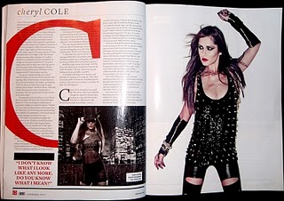
situated on the right hand side of the page. The page includes an A4 image of Florence, this is eye catching and significant to the page. The large image prevents the page looking too busy with a lot of text, the simplicity is appealing to potential readers. The page set up draws the audience into the image of Florence then down the article in relation to her.
The photograph is
situated on the right hand side of the page. The page includes an A4 image of Florence, this is eye catching and significant to the page. The large image prevents the page looking too busy with a lot of text, the simplicity is appealing to potential readers. The page set up draws the audience into the image of Florence then down the article in relation to her. Last year in a Q magazine there is several double page spreads about Lana Del Rey as she found herself in the music industry. The article appears to aim at a female target audience, probably older teens- young adults age range. The article appeals to women more as it discusses Lana's outfits and make up in the Q photo shoot. She wears a 'white crop top and jeans' seems to be an element a female audience would be interested in. There is lots of intense description used when explaining her facial features, 'the epic pout' and 'big deep pools of her eyes'.
 The colours on the page including the text, title, image and background all stick to a specific theme. The colours being white, black, red and orange. The white background allows the image and text to stand out. The black text is a contrast to the white background and the colourful image is an obvious opposite to the background. The article itself talks about Lily's music career, unlike a women's magazine it doesnt focus on the gossip of celebs, much more about what they are doing musically and what they hope to do in the future. This article is also a cry out to the audience from Lily about what she believes she is really like.
