Q Cheryl Cole
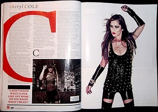
This Q double page spread features Cheryl Cole. There is an A4 image used on the right side of the page, this is attention grabbing and informs the reader of who the article is about straight away. The image of Cheryl has a rock chick feel to it, unlike Cheryl's normal appearance it may indicate her current music career or be used to be more appealing to the typical Q readers.
The large red 'C' behind the text is often used by Q in their double page spreads about different music artists. It is good as it can mean articles are instantly recognizable as Q and also helps define who the artist is in the article.
The smaller image of Cheryl on the left hand side is a shot from her own music video, compared to the image on the right which has been taken in a studio for the purpose of the article. The smaller image gives a more realistic take on Cheryl and what she does as part of her music career.
The colours of the page are very bland, mainly black and white, including the images of Cheryl. This makes the large red 'C' really stand out behind the text, this draws the readers attention onto the text. This is important to make the text appeal to the audience so they can actually be interested in the content of the magazine for future sales and popularity.
No comments:
Post a Comment