Before beginning my magazine i asked people from my potential target audience some questions in relation to the way my magazine would appear. I asked them questions such as what would be the most suitable name for the magazine (out of a selection), would you want a male, female or mixed artist/artists on the front cover, how many people would you want to appear on the front cover (single or group), any special features, e.g freebies, posters or competitions. I asked the questions, filmed the responses and i have finally edited the video and I will be uploading it onto my blog soon, I used all the feedback in my work previously.
I created my first attempt of my music magazine, the cover, contents and double page spread. I collected feedback off my peers, this was useful in giving me more ideas and where I could improve. Also because my peers are mainly part of my target audience therefore the feedback I received was very useful. My initial cover, contents and double page spread wasnt particularly impressive as it took me quite a while to develop my skills using the Adobe software, so I knew I would have to really up my work after the initial deadline.
Once all my photos have been edited and tweeked into professional looking snaps I have began to work on InDesign. I used the programme for my preliminary task of a school magazine, on my first attempt my skills were very basic and my school magazine didnt look very professional! Now I have found how to add new fonts and to add different box options, banners and windows.
development
I've been developing my skills on Photoshop through practice and more practice! Since my school magazine my skills have came on massively, I've found where lots of buttons and short cuts are, this allows me to edit my photos to look better quality and more professional. This is important for the quality of my final magazine.
Q History
I researched into my style model, Q magazine to get some background information on the magazine. The Q is a British music magazine first published in October 1986. Initially the magazine was called Cue, but was changed to Q after being mixed up for a snooker magazine.
The founders of Q felt the older generations were being ignored by music magazine, so targeted their magazine at 25+ (However my target audience is slightly younger).
The magazine has a mass audience, but could be described at niche as it only appeals to music fans.
The magazine is distributed by different companies depending on the country. In the Uk it is distributed by Source IPD and Speedimpex


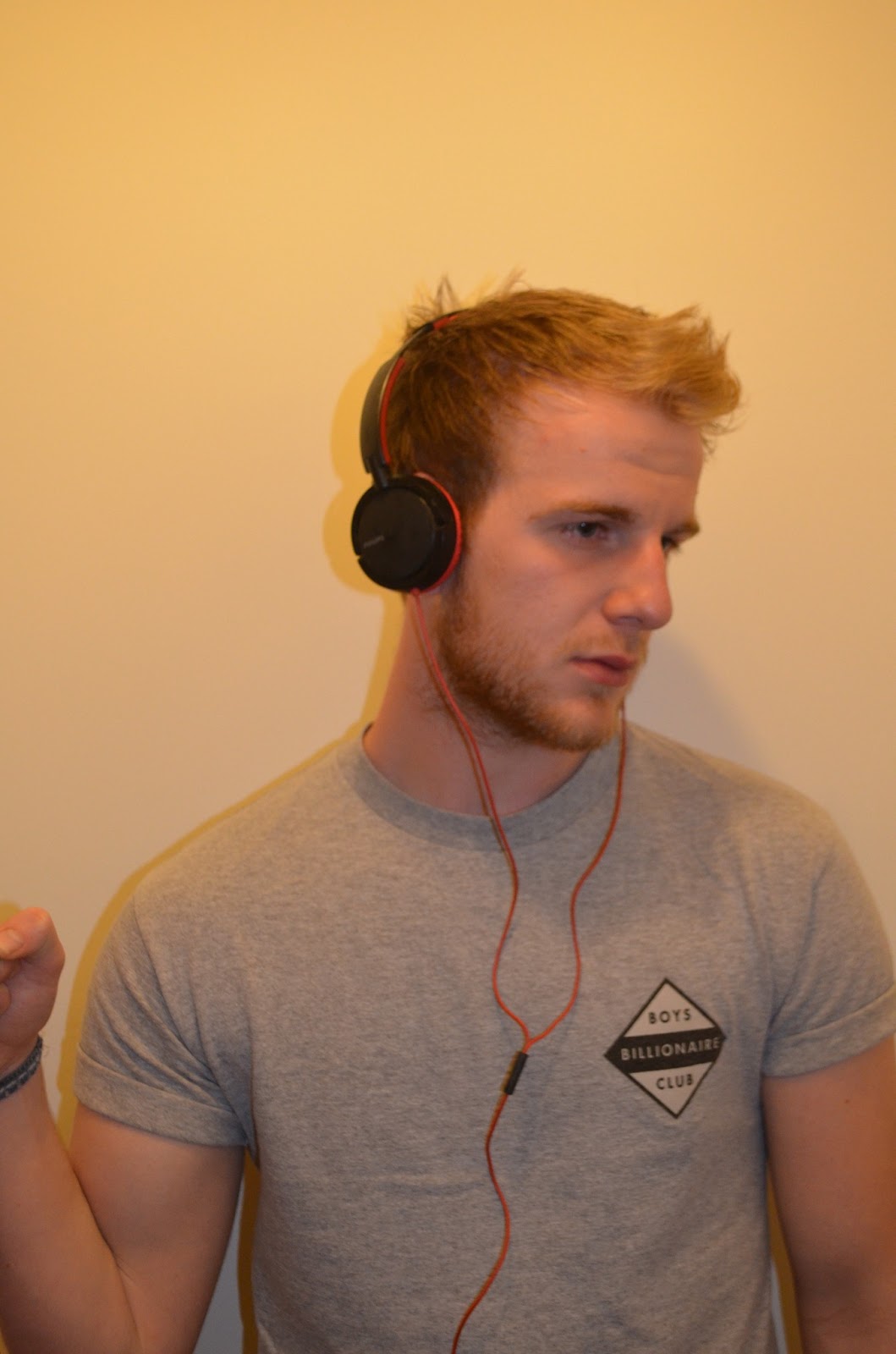
I had a second photo shoot, the images I took will be used for my front cover, as well as a small one for my contents page...


 All the photos had a slightly different angle or position. The main idea behind all the photos was to emphasize the plug of the headphones as the introduction to the artist on the cover will be 'Plug into... ROBO'


Here is a sample of some of the photos I took yesterday during my shoot with Lizzy James...


" All the photos have very different moods and positions. I had some 'fun' photos, as in one of my style models from Q I'd seen similar photos on a double page spread interview similar to what I plan to do. Other photos such as the heart with the fingers reflect the article, how it discusses her love life with Jame Arthur in relation to her music career and there are some more iconic 'possey' photo shoot style photos. "


" All the photos have very different moods and positions. I had some 'fun' photos, as in one of my style models from Q I'd seen similar photos on a double page spread interview similar to what I plan to do. Other photos such as the heart with the fingers reflect the article, how it discusses her love life with Jame Arthur in relation to her music career and there are some more iconic 'possey' photo shoot style photos. "
Style model:
the style model I used for my music magazine is Q. Q is a mainstream music magazine, it is well recognized and works well for the genre of target audience I have. By using Q as a style model I will keep referring to pages in their magazines similar to what I am doing, such as the Contents pages, to get an influence on my own work. I will consider the Q colour schemes, photo composition, fonts and layouts.


the style model I used for my music magazine is Q. Q is a mainstream music magazine, it is well recognized and works well for the genre of target audience I have. By using Q as a style model I will keep referring to pages in their magazines similar to what I am doing, such as the Contents pages, to get an influence on my own work. I will consider the Q colour schemes, photo composition, fonts and layouts.


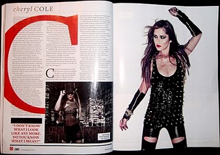
Q Cheryl Cole
This Q double page spread features Cheryl Cole. There is an A4 image used on the right side of the page, this is attention grabbing and informs the reader of who the article is about straight away. The image of Cheryl has a rock chick feel to it, unlike Cheryl's normal appearance it may indicate her current music career or be used to be more appealing to the typical Q readers.
The large red 'C' behind the text is often used by Q in their double page spreads about different music artists. It is good as it can mean articles are instantly recognizable as Q and also helps define who the artist is in the article.
The smaller image of Cheryl on the left hand side is a shot from her own music video, compared to the image on the right which has been taken in a studio for the purpose of the article. The smaller image gives a more realistic take on Cheryl and what she does as part of her music career.
The colours of the page are very bland, mainly black and white, including the images of Cheryl. This makes the large red 'C' really stand out behind the text, this draws the readers attention onto the text. This is important to make the text appeal to the audience so they can actually be interested in the content of the magazine for future sales and popularity.
Double page spread florence
NME
'Florence and the Machines'.
 The photograph is
situated on the right hand side of the page. The page includes an A4 image of Florence, this is eye catching and significant to the page. The large image prevents the page looking too busy with a lot of text, the simplicity is appealing to potential readers. The page set up draws the audience into the image of Florence then down the article in relation to her.
The photograph is
situated on the right hand side of the page. The page includes an A4 image of Florence, this is eye catching and significant to the page. The large image prevents the page looking too busy with a lot of text, the simplicity is appealing to potential readers. The page set up draws the audience into the image of Florence then down the article in relation to her.
The title of the article plays on Florence's song 'You've got the love' combining it with her current stage in her career, making it in The United States.
It also has USA in
very large writing to fill up the extra space in the backround. It is in a pale,
light font. The paleness of the font prevents it from standing out too much.
This isn't needed because it already stands out due to the size of the text. The
text is also in capital letters which makes it stand out even more. This heading
implies that the text has something to do about the USA.
The font for the text
is a small sized font. This allows the article to fit onto the page. It is also
black, which makes it look professional as it stands out against the white/grey
background. Also, the font is very clear. This makes it readable. It also makes
the double-page spread look professional, because if it was in a fancy font the
whole page would look overdone. It gives a very simple, yet effective
look.
The article includes
a subheading before the text for an introduction to the article. This gives an
overall summary and idea of what the article is about. It is in a reasonably
small font, but is just a bit bigger than the text of the article, just to make
it slightly stand out. It is in a plain, simple styled font to ensure that it is
clear and readable. There is also a use of highlighted words 'Florence Welsh'
shown in the colour blue, because it is the name of the artist emphasizing that the article is souly about her. The first letter of the first word is in a big, bold fancy font. This
makes it stand out to show that it is the beginning of the article. It also adds
to the style of the page.
The colour theme is
rather overall dull including colours such as grey, black and white. It also has
a small amount of red in the photo. The dull colours contrast with the red, giving the page a nice simple colour scheme without being too busy or on the other side too bland. The red also works with Florence's hair, and the white and red stripes mimic those of a USA flag, which has a reference to the text in the article.
Lana Del Rey Article Analysis
Q Lana Del Rey
 Last year in a Q magazine there is several double page spreads about Lana Del Rey as she found herself in the music industry. The article appears to aim at a female target audience, probably older teens- young adults age range. The article appeals to women more as it discusses Lana's outfits and make up in the Q photo shoot. She wears a 'white crop top and jeans' seems to be an element a female audience would be interested in. There is lots of intense description used when explaining her facial features, 'the epic pout' and 'big deep pools of her eyes'.
The first letter of the article is nearly the length of the page, and half the width. Often the first letter of a magazine article is larger than the majority of the text but this article has the first letter majorly over exaggerated. The letter fills in white space of the page without having any other photos than the main photo of Lana Del Rey; the one photo draws all the audiences attention to Lana. The title of 'Lana Del Rey' is small part of the page, the words seem irrelevant to the large image of Lana which is more useful in defining who the article is about. The image of Lana is very colourful and contrasts with the opposite side which is bland with just black and white colours.
NME Lily Allen Article
The double page spread features Lily Allen, giving an in depth, truthful article about the artist. The page is loud and stands out to anyone reading through the magazine. The title is a quote from Lily in a extremely loud font, the font is rebellious and unusual reflecting what Lily is saying in the speech quote. The way in which some of the letters are larger than others seems to really shout out to the audience. The A4 image of Lily to the right of the title has a similar rebellious feel with her dark make up, tattoos on show and choice of outfit. The image and title not only reflect the text in the article but also Lily's own personality and the way in which she wants to come across through her music.
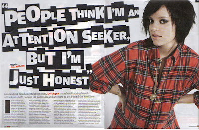 The colours on the page including the text, title, image and background all stick to a specific theme. The colours being white, black, red and orange. The white background allows the image and text to stand out. The black text is a contrast to the white background and the colourful image is an obvious opposite to the background. The article itself talks about Lily's music career, unlike a women's magazine it doesnt focus on the gossip of celebs, much more about what they are doing musically and what they hope to do in the future. This article is also a cry out to the audience from Lily about what she believes she is really like.
Q Contents Page Evaluation
 There is a large image of a man in the music industry used, which covers half the page. The image itself fits with the colour scheme of the page. The photo is taken in a studio, but is emphasized through the camera equipment in the background. The photo is used to show the sort of behind the scenes of a photo shoot. The photo is very natural, therefore the audience feel they can connect with the man, this is often the case in the articles in the magazine. Unlike celeb style magazines, music magazines tend to focus on looking at the artist themselves and their music rather than the newest gossip. So images which seem natural and real on the contents reflect the magazine inside. The positioning of the photo is in the centre to the right. The smaller adverts for different pages border two sides of the image, this draws the attention in to the main image then round to the outside to the smaller sections.
The Q contents page consists of a British theme. There is an article in the magazine about the 50 Ultimate British songs; the article advert becomes a main focus of the contents page as it has the largest and top section of the 'Features' column. The British flag is signification on the page as it fits with the colour scheme of the magazine. Q is an iconic British magazine, this is reflected in the magazines colour scheme, the white, red, blue and black which are the colours of the British flag. Q magazine has a recognized branded appearance throughout all of their magazines.
 There is a large image of a man in the music industry used, which covers half the page. The image itself fits with the colour scheme of the page. The photo is taken in a studio, but is emphasized through the camera equipment in the background. The photo is used to show the sort of behind the scenes of a photo shoot. The photo is very natural, therefore the audience feel they can connect with the man, this is often the case in the articles in the magazine. Unlike celeb style magazines, music magazines tend to focus on looking at the artist themselves and their music rather than the newest gossip. So images which seem natural and real on the contents reflect the magazine inside. The positioning of the photo is in the centre to the right. The smaller adverts for different pages border two sides of the image, this draws the attention in to the main image then round to the outside to the smaller sections.
The titles of the feature section tend to be names of artists or bands such as James Blake, Edward Collins and Elbow. The names are clear and in bold, the audience is drawn to this section and the use of names would attract the audience to want to read more about the artists. Another way in which Q advertises pages later in the magazine is through smaller versions of the pages and then their page numbers fairly large and bold over the top.
The image isn't just used to fill up space, it is an advert for a page in the magazine. Without any words the audience is intrigued and can find out more about the photo on page
'42' which is wrote in a very large font on top of the corner of the image.
The title of 'Contents' is placed on an extended 'Q' logo red box. The title isn't a substantial part of the page, the font is similar to all the text on the page and the size is not significant. This is because the objective of this page is clear through the images, page numbers and subtitles. The 'Q' logo also isn't partially significant as Q is so well known it doesn't need to emphasize what magazine it is.
Q Contents page
The Q contents page first draws the attention the fairly large, standing out 'Q' logo. The page also consists of a large image. The image being of Elton John, a well recognized iconic British music artist. The image of Elton John is an advert for an article about him later in the magazine, the advert has no text which would intrigue the reader into wanting to know more. The magazine can do this because Elton John is so well known that they know people would be interested in an article about him.
 The colour scheme is simple, red, white and black. The colour scheme runs through out Q magazines and gives the magazine a well branded appearance. The page is set out in a series of boxes ans subheadings. The boxes allow the magazine to fill the page with information without appearing too busy so the reader is put off reading into the different articles. The contents page only advertises a few pages in the magazine, but there are many more in between The articles used on the contents page are a range of different interests in the music industry so appeals to wide range in their target audience.
Q magazines are pretty mainstream. The artists included tend to be very well known and liked by many. Often as well they are involved in the pop genre, but there are some articles which vary, such as the article about whether Indie is hooked on crack.
The page uses all the space, it even sneaks in a small part about a Chris Moyles article along the bottom, filling the page gives the magazine the appearance that is full of interesting articles and it has a lot of content.
The fonts are bold for titles and subtitles, and all the fonts are a clear plain type which is easy to read. The fonts all seem to match and keep the busy page looking neat. The page numbers stand out because they are in red; this is important as the audience want to know exactly where the articles are and to use the contents page to navigate around the magazine.
The target audience attracted to this page could be argued is very varied. Some may say the Elton John feature appeals to an older audience, along with articles about U2. However it is hard to define what artists and bands appeal to one age range because musical tastes are often passed down through families and generations.
The Q contents page first draws the attention the fairly large, standing out 'Q' logo. The page also consists of a large image. The image being of Elton John, a well recognized iconic British music artist. The image of Elton John is an advert for an article about him later in the magazine, the advert has no text which would intrigue the reader into wanting to know more. The magazine can do this because Elton John is so well known that they know people would be interested in an article about him.
 The colour scheme is simple, red, white and black. The colour scheme runs through out Q magazines and gives the magazine a well branded appearance. The page is set out in a series of boxes ans subheadings. The boxes allow the magazine to fill the page with information without appearing too busy so the reader is put off reading into the different articles. The contents page only advertises a few pages in the magazine, but there are many more in between The articles used on the contents page are a range of different interests in the music industry so appeals to wide range in their target audience.
 Q magazines are pretty mainstream. The artists included tend to be very well known and liked by many. Often as well they are involved in the pop genre, but there are some articles which vary, such as the article about whether Indie is hooked on crack.
The page uses all the space, it even sneaks in a small part about a Chris Moyles article along the bottom, filling the page gives the magazine the appearance that is full of interesting articles and it has a lot of content.
The fonts are bold for titles and subtitles, and all the fonts are a clear plain type which is easy to read. The fonts all seem to match and keep the busy page looking neat. The page numbers stand out because they are in red; this is important as the audience want to know exactly where the articles are and to use the contents page to navigate around the magazine.
The target audience attracted to this page could be argued is very varied. Some may say the Elton John feature appeals to an older audience, along with articles about U2. However it is hard to define what artists and bands appeal to one age range because musical tastes are often passed down through families and generations.
Subscribe to:
Posts (Atom)